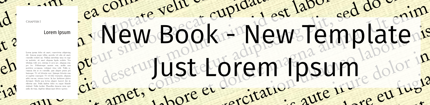
My new book, “Just Lorem Ipsum” is a demonstration of the use of open-source software for book production. The idea is to use open source software, free fonts and self-produced graphics for the book. Since this is an exercise, I am going to use Lorem Ipsum placeholder text. Lorem Ipsum is fractured Latin, derived from a passage in “De finibus bonorum et malorum” by Cicero dating from the 1st century BC. I envision a slim volume of about one hundred pages. What could I call it but “Just Lorem Ipsum”? I chose a 8×5.25″ trim size for the book. This gives me an opportunity to provide a Scribus template in this new size. (Updated on 6/20/16.)
Just Lorem Ipsum
I wanted to produce a smaller book than the 9×6 size that I used for the Schnoz of the Rings and for my earlier Scribus and LibreOffice templates. The 8×5.25″ trim size is pleasing and is available from both Amazon and IngramSpark so I decided to go with it. I’ve got a preliminary example PDF of the front matter and the first two chapters: Just_Lorem_Ipsum_(part).pdf. (Scribus files available below).
The Fonts
To use the templates directly, you are going to need some fonts. Get them here:
Latin Modern Roman – I made extensive use of LM Roman: Most of the front matter, the body text, and the running heads are LM Roman. I used regular, small caps, and italic in various sizes.
Cinzel – A typeface inspired by 1st century Roman inscriptions. I used it for the chapter numbers and the table of contents.
Fira Sans Condensed – I used Fira Sans Condensed for the Chapter Titles.
I noticed I got all of these from FontSquirrel but they are available from other sites as well.
The Templates
I provide two Scribus files, one for the front matter and one for chapter formatting. Scribus slows down with large files so I break the work down into chapters, make individual PDF files, and combine them for the final file. I use a Linux tool, pdftk, to combine the files but there are tools for Windows and Mac.
The Downloads
Note the the .sla file are text files. They open in my browser, which is annoying. Just “save page as”, give them the extension “.sla”, and you will be fine. Or download the Just_Lorem_Ipsum.zip file, unzip it, and you’ll have the .sla files with no fuss.
Just_Lorem_Ipsum.zip – (342 kB) This unzips to a folder containing everything below.
Just_Lorem_Ipsum_Front.sla – (50 kB) This is the Scribus file for the front matter.
Just_Lorem_Ipsum__Chapter.sla – (66 kB) the Scribus file for the chapters.
How_To_Use_the_Just_Lorem_Templates.pdf – (42 kB) Some basic instructions.
Just_Lorem_Ipsum_Specifications.pdf – (52 kB) File specifications: page formats and styles.
Just_Lorem_Ipsum_(part) – (342 kB) The front matter and the first two chapters of Just Lorem Ipsum.
Notes
- I used Roman numerals for page numbers (it just seemed fitting.) You probably don’t want to do this. Change the style of the page numbers in “Sections”: Menu-File-Document Setup-Sections. Choose the style of numbering you want. (This is also where you change the starting page number for the chapters.)
- The .sla files were updated on 6/20/16 and correspond to the interior of Just Lorem Ipsum.
- The whole text of Just Lorem Ipsum is available as a .PDF file on my post on 6/20/16
- Try the templates for your book. Change anything you like Go crazy!
- This post was updated on 6/20/16.
John, thank you for all of the great info here. I’m an author and niche publisher and digging in to take my productions up a few levels. I’ve done a fair amount of research on book design. I’ve known about the Golden Rectangle for decades and incorporate it in the things I design. I was very intrigued to discover that early publishers/printers either knew of it or arrived at it empirically-see https://en.wikipedia.org/wiki/Canons_of_page_construction#Van_de_Graaf_canon for example.
Which leads me to my question–I notice that your template doesn’t follow one of these canons of page construction and I wondered what your thoughts on them are. I personally like the look of the offset page margins and large whitespace at the bottom of the book. Perhaps modern publishers are more concerned with printing/paper costs so they tighten up the margins. Maybe there are other reasons. Thanks in advance, Michael
You are correct: modern publishers won’t allow as much white space as the van de Graaf canon specifies. Also, the modern publishes allow more space in the fold to keep your words from disappearing in the crack!
Here are some sources for page design:
Joel Friedlander runs The Book Designer site and there is a lot of information there. Beware: sign up for something and you will emails nearly every day trying to sell you something.
The Independent Book Publishers Association has an industry standards checklist that contains examples for book interiors.
Createspace will sell you simple book interior design services for the low, low price of $249. However they have a cool file of pre-designed templates that you can download free.
The templates I offer on my site are very basic. They are designed to get you started with Scribus.