Do you like impressionist paintings? Are you a photographer? Let me introduce you to GIMPressionist, a filter in the graphics program GIMP that you can use to render your photos in the impressionist style. The GIMPressionist filter “paints” brush strokes over your photo to give a painting-like feel to the photo. You can control many aspects of the process including brush type, with, aspect ratio, angle, and, as you will see, many more.
Swan Boat, Boston 2018
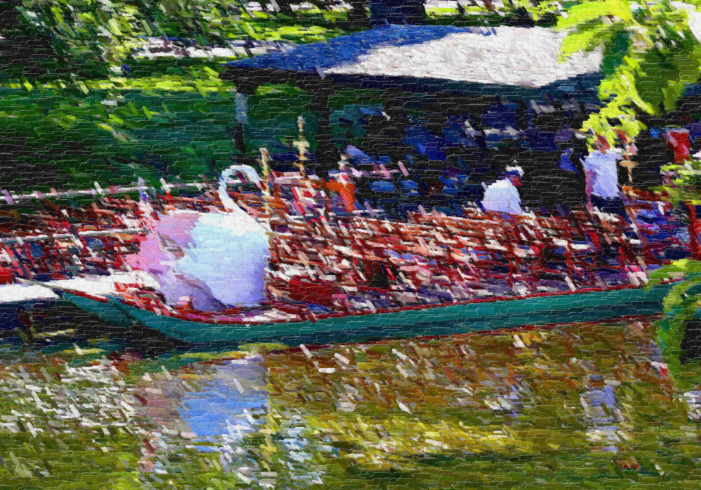
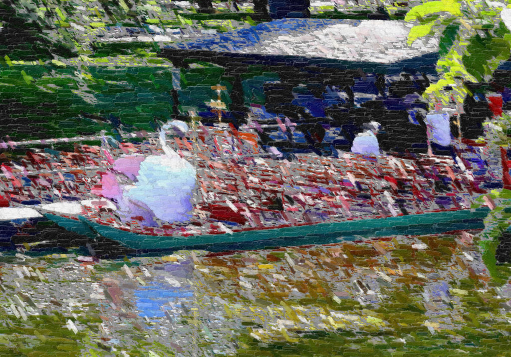
Here is the GIMPressionistic Swan Boat. In this post, I’ll show how I made this image from a photograph I took in the Boston Public Garden. For a while, you can see an enlarged version of this image in the Five Frames Gallery.
The Original
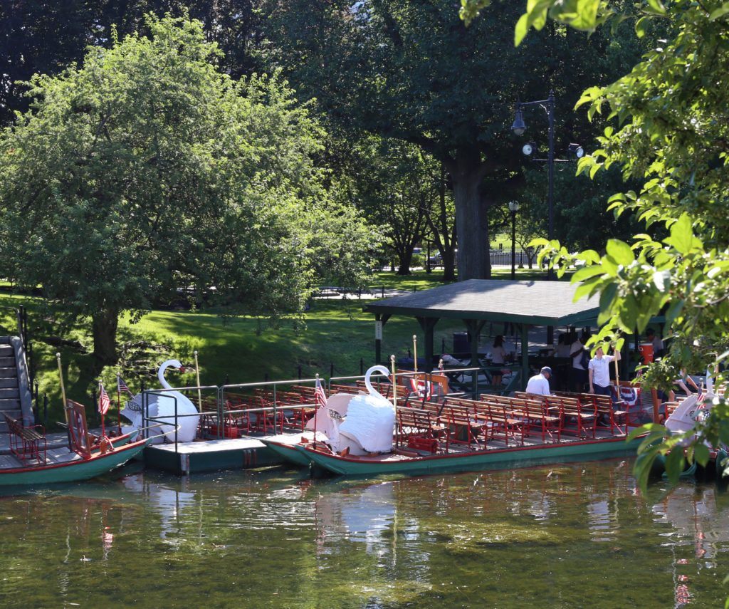
Here is the original shot. I took it from the suspension bridge in the Boston Public Garden with a Canon 6D wearing a 50mm lens. I often just take a 50mm when I’m traveling. It’s light, sharp, and fast, what’s not to like? The original photo was 3472 x 2901 pixels. For the blog, I reduced it to 1500 x 1253 pixels (above) so it would load faster.
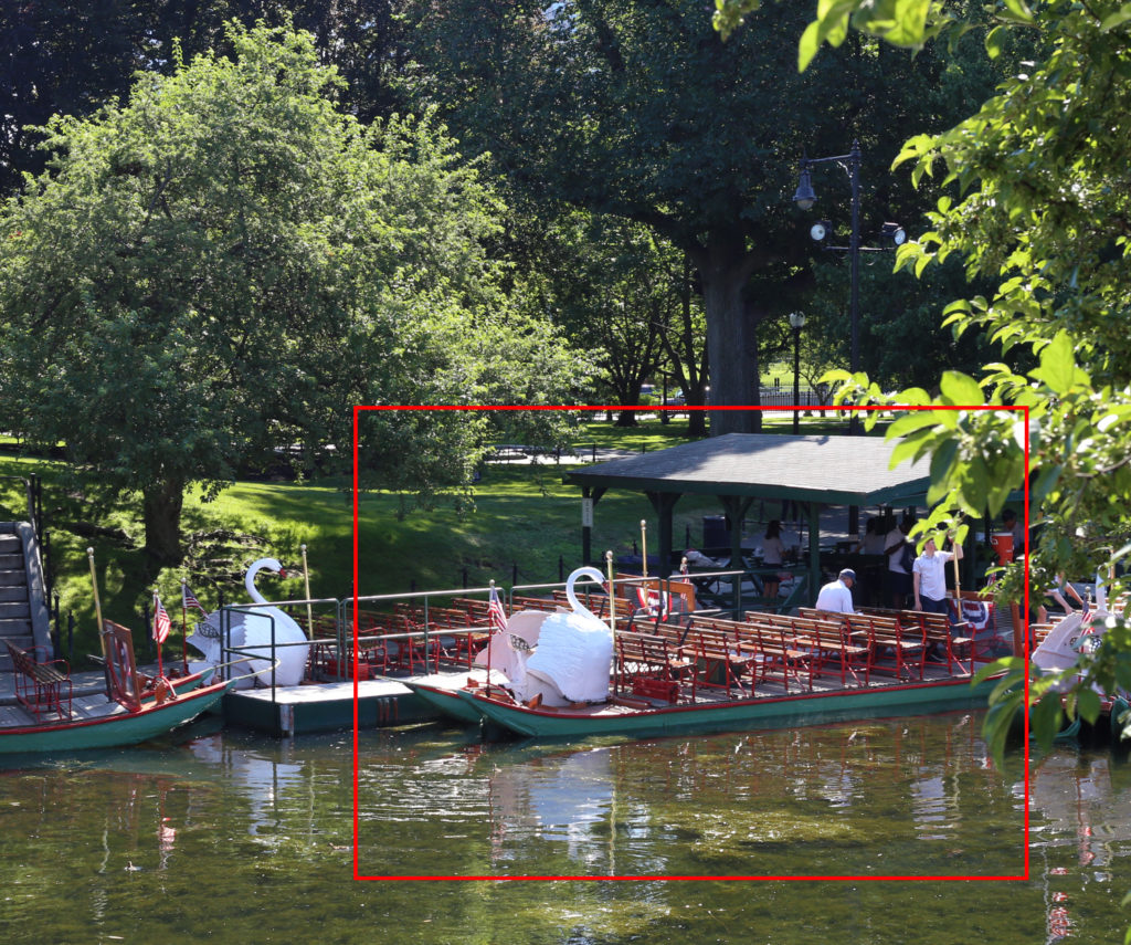
The red box marks the part of the original picture I used for the final image. I cut this part out using the GIMP and reduced it to 1500 x 1049 pixels.
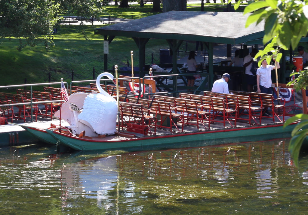
This is the result of the cropping.
Preparation
Before I ran GIMPressionist filter, I increased the contrast and saturation of the image. The idea is to give the saturated colors of impressionist work.
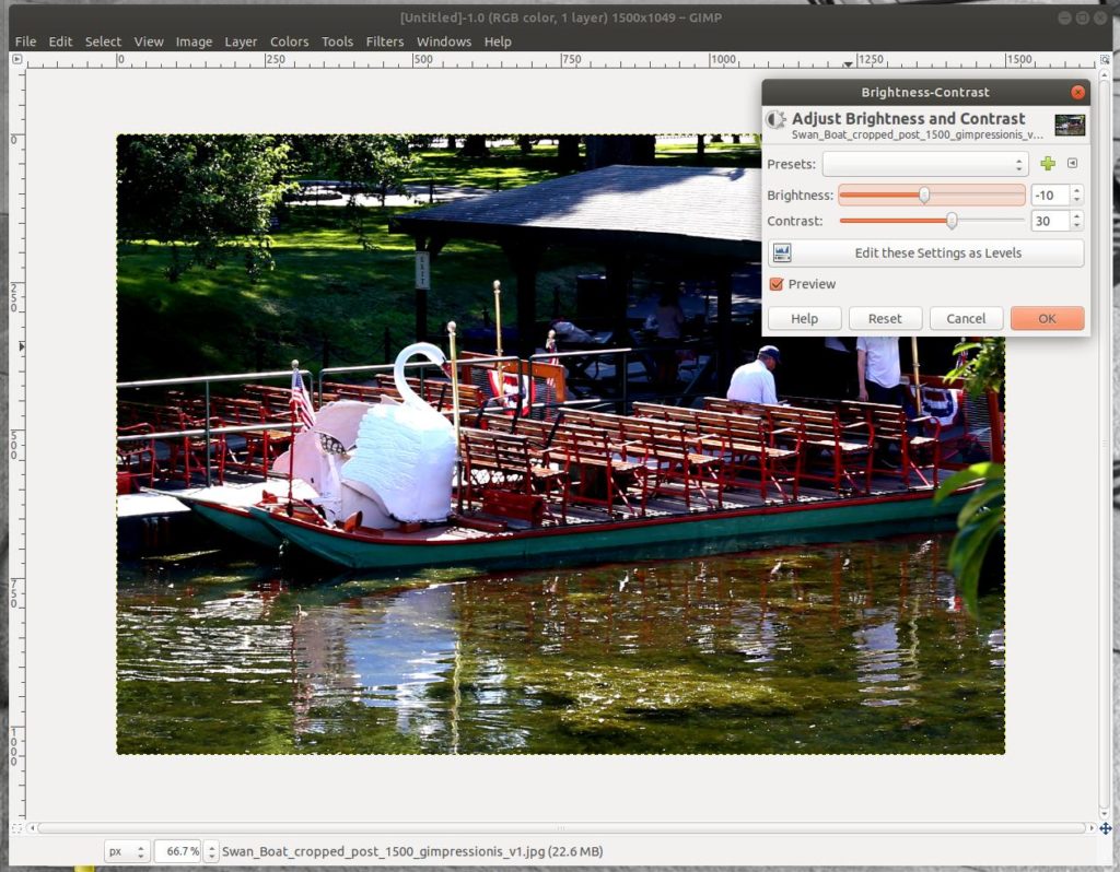
First the Brightness and Contrast. Under the colors menu, choose Brightness and Contrast. You get the box shown in the screenshot above. I increased the contrast and decreased the brightness. This isn’t scientific, I just judged it by the image. Your results will depend upon your image.
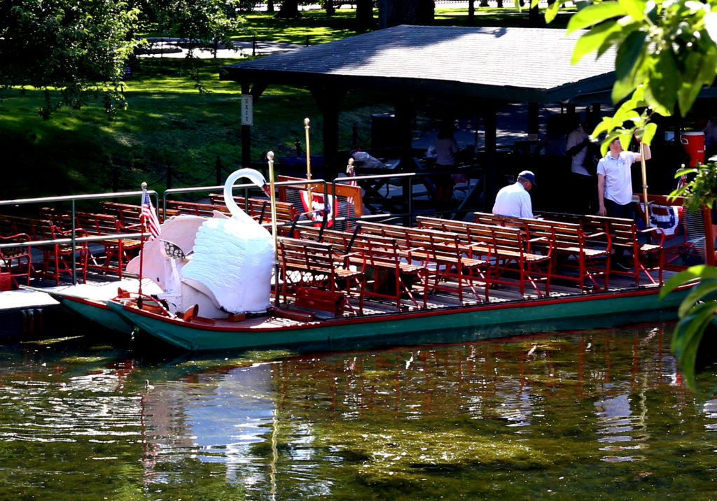
The resulting image is nice and punchy, especially compared to the starting point. Next up: saturation.
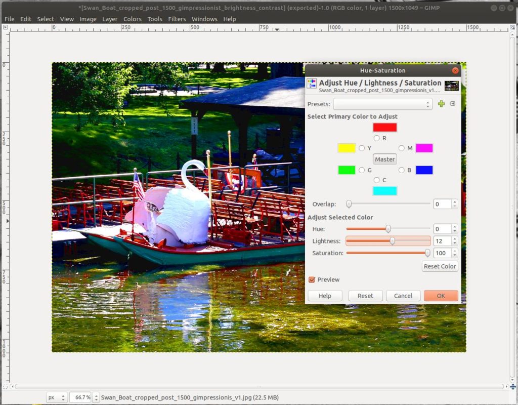
Under the “Colors” menus choose “Hue and Saturation”. I increased the Lightness and the Saturation. In both cases the defaults are zero. I maxed out the Saturation.
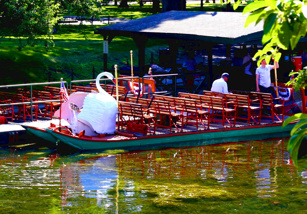
Here is the image after contract and saturation enhancement. Now to make GIMPressionist do its magic.
GIMPressionist
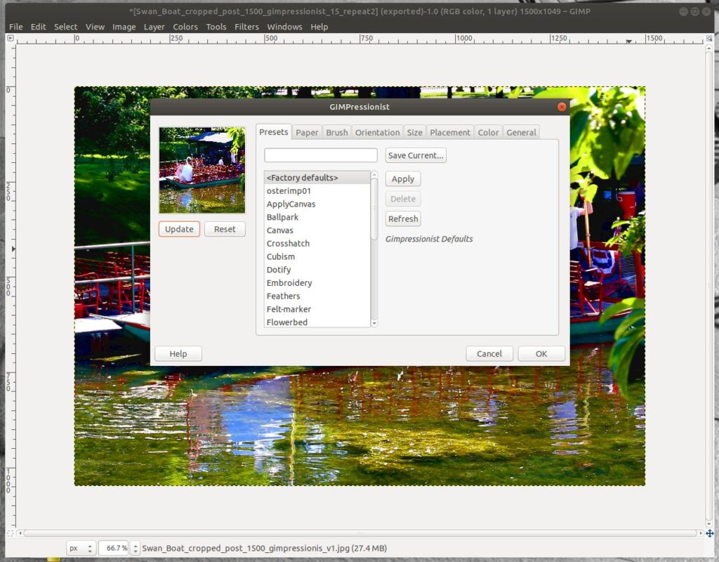
To start GIMPressionist go under “Filters”, choose “Artistic”, then “GIMPressionist”. A window opens as shown above. There are a lot of options. To make an image that is pleasing to you, you will have to play around. I don’t think there is a single set of settings that will give you happy results every time.
Setting
Here are the settings I used to make my final image (your mileage may vary…):
Paper
defaultpaper.pgm
Scale 30.0
Relief 50.0
Brush
defaultbrush.pgm
Asptec ratio 0.00 (default)
Relief: 50.0
Orientation
Directions 20
Start angle 0
Angle span 60
Orientation Adaptive
Size
Size variants 16
Minimum size 20
Maximum size 40
Size depends on Adaptive
Placement
Randomly
Stroke density 50 (this is the max)
Color
Center of brush
Noise 0
Background From paper
check – Paint edges
Edge darken 0.10
Shadow darken 20.0
Shadow depth 10
Shadow blur 4
Deviation threshold 0.10
When you press “OK” (see window above), the GIMP starts “painting” your image. It actually says “painting” at the bottom and and orange progress bar extends across the bottom. It took my setup about three minutes to do the calculation, but I’m running an ancient computer. The result of this run is the image shown at the beginning.
I made seventeen runs while trying different settings. The one I picked was number 15 out of 17. The nature of the image is affected significantly by the brush size and angle. Colors are brighter if you take them at the center of the brush area rather than averaging them. Obviously there are gazillions of combinations of settings. So I only sampled a few.
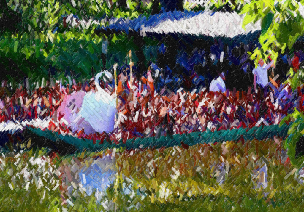
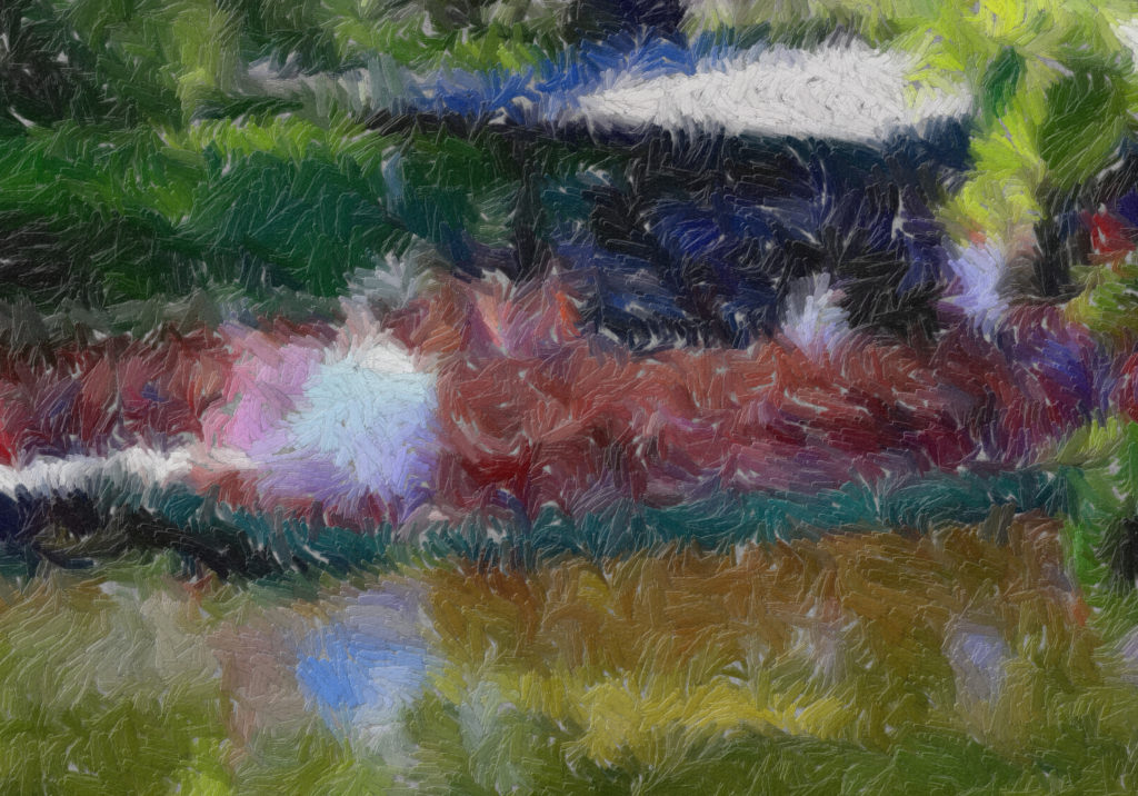
Alternate Images
This is version 2. It was produced with a minimum brush size of 10 and a maximum of 50. Otherwise, the settings were the same as the final version. I didn’t like the area around the swan boat benches as much as I did with the final image, which uses a wider minimum brush and a narrower maximum brush.
This is version 12. The settings different from version 15 were: Size: minimum = 30, maximum = 60, Orientation: Directions = 30, Start angel = 45, Angle span = 90. Changing the start angle and allowing a wider rage of brush strokes caused the benches to disappear into chaos. This might work well for a different subject.
This is version 10. On a lark, I tried the Orientation = Flowing setting. This was the result. It is interesting, but not what I wanted for this image. The flowing setting might work well for a different brush size and a subject with harmonious lines.
That’s it for my GIMPressionist demo. The result wasn’t exactly Monet, but it was fun. Because of the gazillions of combinations of setting, you have the capability to make an image your very own little piece of artwork. Enjoy!
The GIMP is the GNU Image Manipulation Program. It does most of what Photoshop does only GIMP is free. It will run on Windoze, Mac, Linux, and other operating systems. Give it a try.
wow! A lesson!!